How To Make A GIF Using Python | An Application with The United States Wind Turbine Database
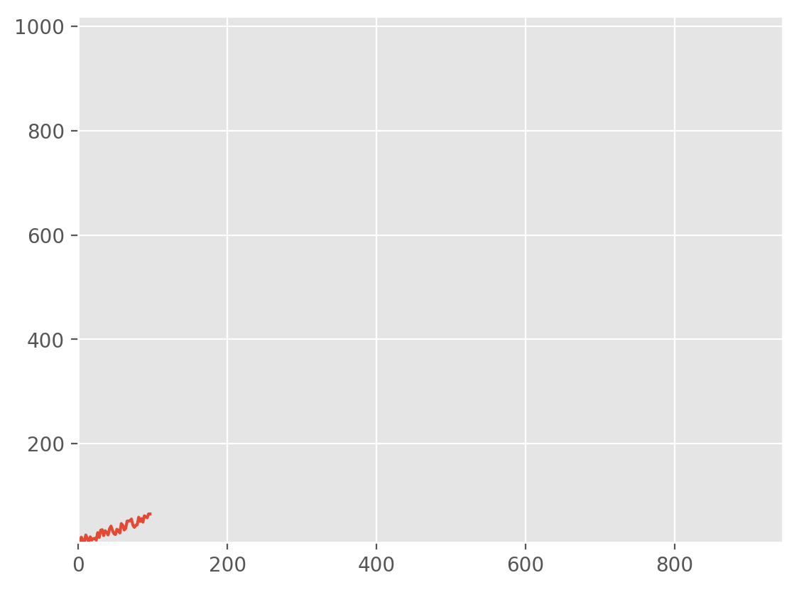
Figure 1: GIF demonstration using random data and 'gifly' algorithm.
The graphics interchange format, or GIF, has become widely used for animation in both the general internet and science/data communities. GIFs are a great way to consolidate images into one dynamic information file, while avoiding video codec issues between platforms. The GIF overcomes cross-compatibility issues by being self-contained as a looping image file without any audio. Its format is standardized such that when uploaded to PowerPoint, Word, HTML, etc. - the animation remains unchanged. Its simplicity and consistency deem it a great candidate for applications in data visualization where sound is not needed and multiple loops are beneficial.
Algorithm and Python Function
Below is the function used to create each GIF used below. The function takes matplotlib figures and saves them as .png files in a nearby folder. When the figures are finished plotting, the library 'imageio' takes the .png files and loops through them with the selected interval and saves them as an animated .gif file. The Github repository for creating a Python GIF can be found here at the project's page entitled 'gifly.' You can also click on the GIF above to be taken to the project's page.
Simple Implementation of Gifly
The code below is the script used to create the wavy GIF at the top of this page. It uses a simple random generation and sinusoidal warping to update the figure using matplotlib's 'set_ydata' and 'set_xdata.' This method creates GIFs very quickly because it only has to update the data in the existing figure and save it as a .png file.
More Complex GIFs
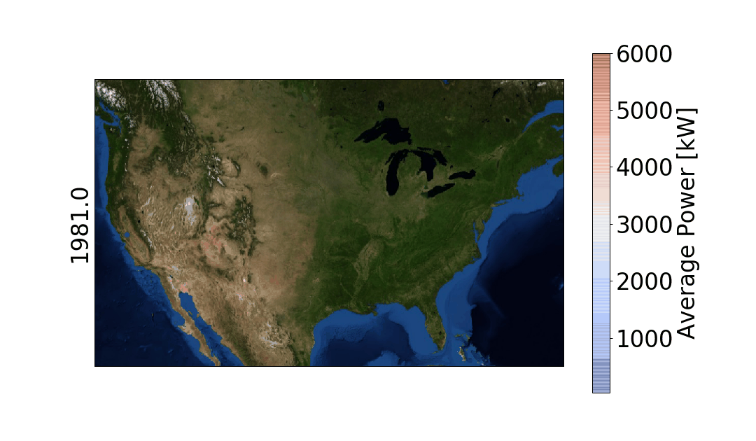
The wind turbine database has its own viewer (admittedly better than anything we'll be creating here), so if you'd like to see that and inspect the points, head here. The data, for reference, look like the figure shown below, which we will be attempting to replicate in .gif format to show the installation of turbines over time.

Figure 2: U.S. Wind Turbine Database viewer

Figure 3: Distribution of Turbine Power Capacity [in kW]

Figure 4: Turbine installation from 1981 to 2018.
More Complicated Plot with Marker Size and Color Changes
The scatter plot above shows the temporal variation of wind turbine installations across the continental U.S., however, I don't find it very insightful into the distribution of actual wind power. I decided to take full advantage of Python's plotting capabilities as well as the range of data available in the USWTDB.
The script for reproducing the temporal capacity distribution of wind turbines can be found below.
Conclusion
Above, I presented a Python function for creating GIFs using the 'imageio' method and saving .png files to a nearby directory. This method has been successful in my career relating to data visualization, and I hope it will be useful for a scientist/researcher somewhere in the industry or academia. The wind turbine database proved to be a very interesting application, and the visualizations produced using the 'gifly' method resulted in very meaningful and insightful information regarding the boom of wind turbine energy.
Several issues arose while creating this particular tutorial. First, the issue of Basemap needing to re-plot every iteration was an issue I couldn't solve. Perhaps someone else is able to update the scatter atop the Basemap, however, I was unable. Another issue I discovered was the transition from .png images to .gif image - I found that some colors were lost and produced at times a highly differing animation from the .png images. This can be solved by sticking to a conventional 256 color palette when saving .png files.
See more in Python:


In the past, we explored the NEO-6M GPS module with Arduino through a few of our tutorials (see: "Comparing iPhone GPS Against NEO-6M with Arduino" and "Arduino GPS Tracker"). In this tutorial, we wanted to push the size limits of the portable GPS tracker by using a mini GPS module called the ATGM336H. The result is a pocket-sized GPS tracker with the low-profile by pairing the ATGM336H module with an Arduino Xiao microcontroller, SD Card Module, and 3.7V LiPo Battery. The prototype developed here will be an autonomous tracker that will record latitude/longitude at roughly 1-10 points per second (1Hz - 10Hz) and needs no external components to track geolocation. The prototype can fit in a users pocket and can track for several hours. We will also present a Python program that will plot the geolocation data points that the user can use to view the route tracked by the Arduino GPS datalogger system. The Python analysis demonstrates how well the ATGM336H GPS module and antenna are able to replicate the walking path of a human with great resolution and accuracy.